Composing Your Perspectives / Alex Hogrefe大神系列教程解读 – 透视构图

One of the questions I get asked most is how do I compose perspective shots. I have touched on this subject in past posts but have not organized these concepts into one place. The tips discussed below are by no means the law. There are often circumstances that limit how much the below ideas can be or should be implemented. I break them all of the time. But still, I often start with these ideas as a jumping off point.
关于效果图如何构图的问题是A神最经常被问到的问题之一,所以在这篇文章中A神将分享一些构图时常考虑的要点,并不一定是构图的铁律,但可以作为构图时的参考。
1. Rule of Thirds/三段式构图
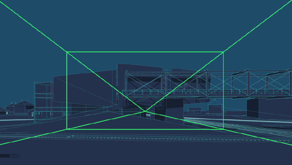
The rule of thirds is one of the more well know photography rules and is one that I use most often. Divide the page into three sections both horizontally and vertically creating nine squares. From there, compose the image so that important moments or focal points fall along the lines or at their intersections.
最常见也是最常用的构图方式,将画面横竖三等分,画面中的各种要素(如地平线、焦点或者视觉重心)和等分线找关系。
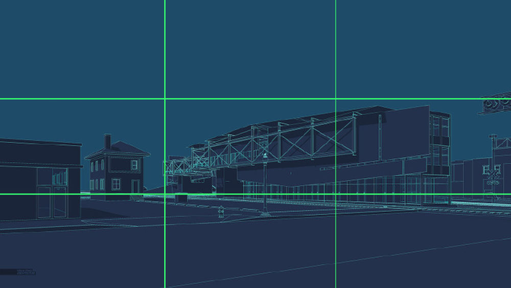
I often place the horizon line of eye level views on the bottom third of the page instead of directly in the center of the image. You will notice that other important elements land on the lines too such as the end of the train pavilion and the railroad crossing lights to the right.
如上图,在人视点的效果图中,地平线的位置在靠下的水平等分线上。
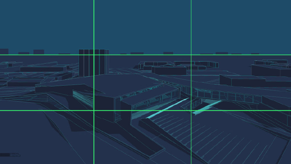
Placing the horizon line on the top third of the page also works for low birds’eye shots.
同样,在鸟瞰图中,地平线在靠上的水平等分线处。
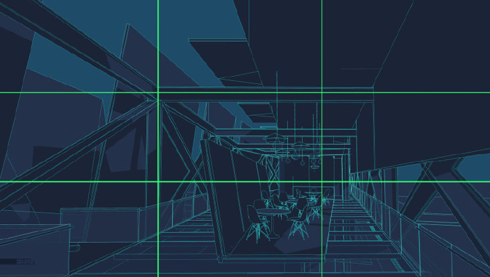
The rule of thirds also works great for interior shots. In this case, the perspective lines converge on the bottom right third of the image. Secondary alignments occur with the beams on the top third and left third.
三段式构图也适用于室内场景。画面中透视的灭点位于右下角的横竖等分线交点处,左上角的等分线交点处也是钢结构的梁柱的交点。这样的构图原则非常经典,有点类似黄金分割原则在审美中的作用,图面会更加耐看。
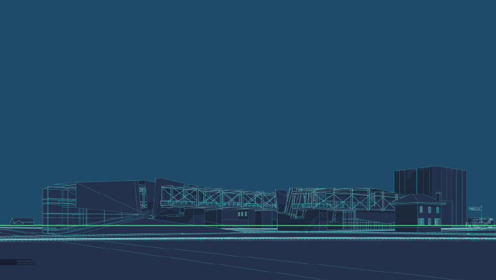
2. Switch to One Point Perspective/一点透视
In other words, set the camera perpendicular to the structure essentially generating a perspective elevation rendering. Though this type of image sometimes comes off as a little static, it can be a good compliment when paired with more aggressively composed images in a series of illustrations. I often implement one point perspectives when I want a place to feel a little more subdued or monumental.
相比于其他构图,一点透视会削弱画面的动势和张立,有一种画面静止的效果。经常表达具有纪念性的场景或者一种安静的状态。在一组渲染图中,适当地使用一点透视构图能很好的与其他特别抢眼的效果图形成对比或互补。
Above, the camera is placed perpendicular to the train pavilion bridge. This creates a lot of horizontal and vertical lines in the image as opposed to diagonal lines dominating the composition.
在上图的表达中,一点透视所产生的很多垂直和水平的线条与画面中的斜线产生对比,突出了要表达的斜线元素。
3. Centering/中心构图
Centering is hard to pull off, but when done well, it can generate a really compelling image. The focal point of the image is placed directly in the center of the image and is hierarchically stronger than all other elements of the composition.
A神大意是中心构图比较难做好,但是一旦做好了就会很出效果。中心构图中要表达的主体位于画面的正中心,画面中的其他元素会处于绝对的从属地位。
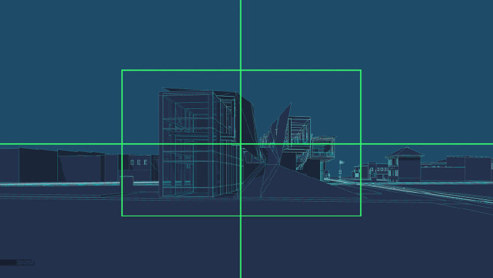
Above, the image is not perfectly symmetrical, but still has a balance to it. The surrounding context is lower, but equal in height, drawing the eye to the center of the image..
如上图,主要想说明中心构图的画面不一定是绝对对称的,但是视觉的中心要在图面正中。
4. Nature Dominate/由环境主导的构图
In some cases, it is less about the architecture and more about the context. In these situations, the horizon line is moved very low giving a lot of image real estate to the sky. The same can be done with the ground plane moving the horizon line high in the image playing up the landscape and minimizing the architecture.
有时候一张图要表达的主体并不一定是建筑,而是建筑所在的周边环境。这种情况下,一般会把地平线压低,留出更多的图幅给天空,或者将地平线提高,更多的表达地面的景观。
The landscape and more specifically the sky now have a pivotal role in this image instead of acting as a background to the architecture.
环境在此时此刻不再是建筑陪衬或者背景,而是主导整个图面内容的重要信息。
5. Get Intimate/直击重点
All too often, images try to cover too many objectives by telling multiple stories about the design. This leads to weaker images because the focus is on checking boxes instead of choosing a view that compositionally is better or that better connects emotionally. Instead of pulling the camera out further and further to get in as much information as possible, move in closer and focus in on a single idea.
通常情况下效果图会尽可能多的表达设计内容,然而过多的内容会弱化画面所传达的信息。所以,适当减少画面中的元素,将注意力集中在单一的内容会更加出彩。可以将这种构图方式理解为摄影中的特写,只专注景物中的某一个细节,忽略其他。
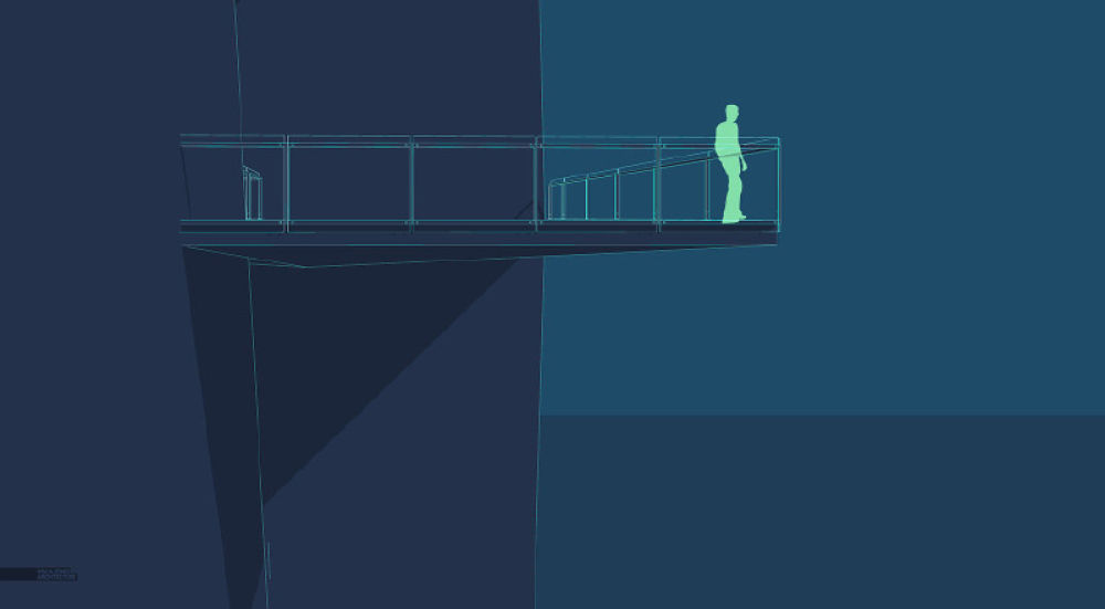
For the cliff retreat image, I could have included a lot more elements of the design such as the grand stair, the ground level deck below, etc. However, I instead focused on one idea which was how the cantilevered viewing platform projected out from the cliff and the contemplative space that this created.
如上图,A神为了表达这个出挑的平台所塑造的空间时,放弃了其所在立面的其他元素,使整个画面的内容一目了然。
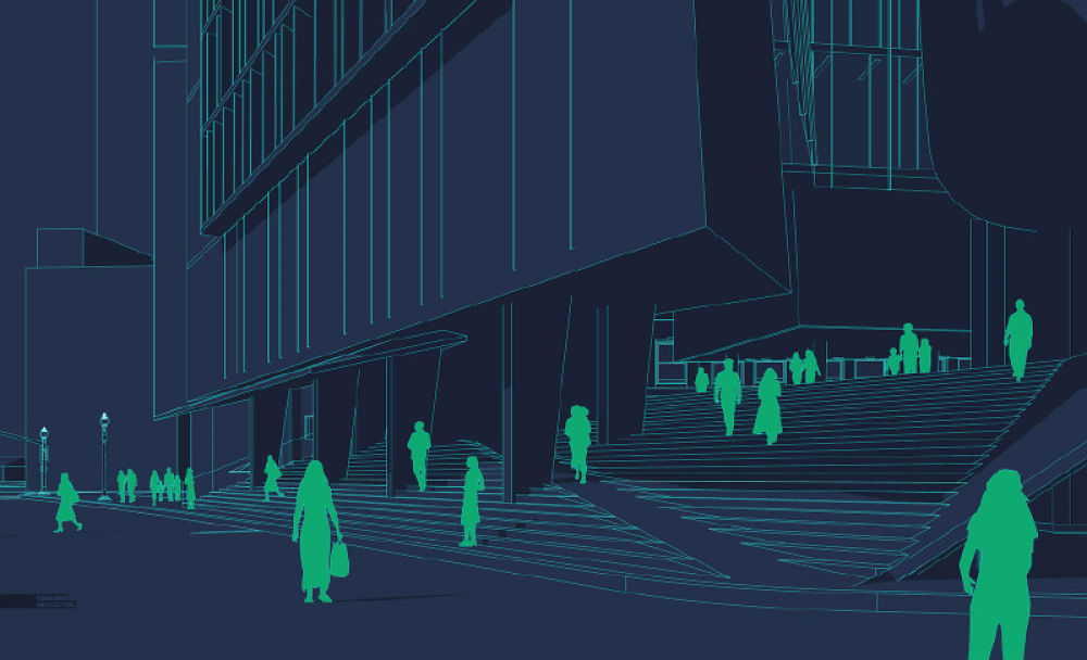
Even though there is a lot going on in this image, there is still only a single focus which is how the street connects to the monumental stair slanting up the culture center plinth.
这张图虽然有很多元素,但是依旧可以看出A神舍弃了建筑主体的形象,整个画面的焦点在街道和入口大台阶的联系上。
6. Correcting the verticals/矫正垂直关系(实际就是上建筑表达中常用的两点透视)
Most, if not all, architectural photographers follow this convention because it is considered a more accurate representation of the architecture. It is simple to execute and adds another level of refinement to the composition. The adjustment is usually made in eye level and low bird’s eye views. Also, images with really tall buildings like skyscrapers will typically have the verticals corrected.
A神的大致意思是垂直矫正在摄影中能更加准确的表达建筑,非常有效且常用。

For shots at eye level such as the one above, often the vertical lines will converge (angle left or right) the further the camera looks up from the horizon.
建筑垂直于地面的边会在透视原理的作用下向天空的方向汇聚,在二维画面中与画面的垂直方向形成一定的角度,矫正之后这些垂直线会与画面的垂直方向一致。
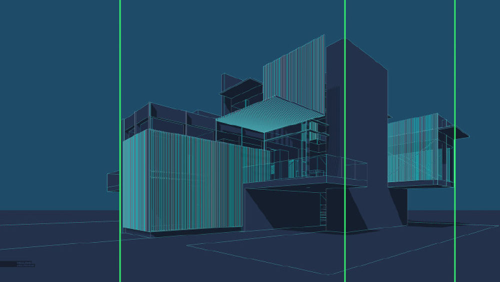
The above image shows the vertical lines corrected. There are multiple ways to do this. I typically set my 3D model software (Sketchup) to “Two Point Perspective” before rendering which solves this problem. However, if the image is already rendered and edited, you can make the correction in Photoshop. I created a tutorial a long time ago describing this process.
实际上在表达建筑效果图的时候,垂直线矫正后会显得建筑更加挺拔,更有张力。一般可以在渲染的时候就选择两点透视或者在PS中通过透视调整命令来修正建筑的垂直线。
7. Don’t be a Giant/避免巨人视角
If you are going to create and eye level view, set the camera height to around 6′ to better connect the viewer to the experience of being at that space. People often rationalize that they want to better see the ground plane so they raise the camera to just above head height at 8′, 10′, 12′, etc. However, this makes for an awkward and uncomfortable composition. This rule does break down a bit if you are dealing with extreme sloping sites or standing on a terrace or balcony.
在人视点的构图中,相机的视点高度应设置在一个正常人眼睛的高度。但是有时候当我们希望看到更多的地面时,会将视点提高,但是这样会产生一个很不舒服或者说很不习惯的构图关系,感觉画面是来自进击的巨人的视野。当然,如果视点所在的位置是一个大斜坡或者阳台上,那么较高的视点也是可以接受的。
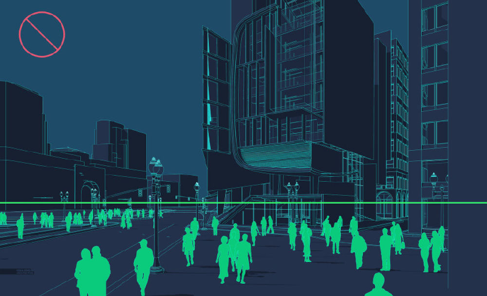
The camera of the above image is set around 10′ above the ground. It is hard to tell if the camera is placed on a balcony, if it is being held by a giant, or being taken by a low flying drone. It is important to clarify the intent by either dropping it to eye level or raising it up to 25′ or 30′.
在上图中,视点的高度已经超过正常人眼睛的高度,并且不是在阳台或者斜坡地形上的,所以应该将视点高度降低或者将视点抬高形成鸟瞰的构图。

Here, the camera is set at 6′ and gives a better sense of being in the space among the people.
将视点高度修正后,感觉就舒服了很多如同站在人群中看这个场景,显得画面比较自然。
When composing an image, there are so many variables to take into account that it can be somewhat overwhelming. Ideas on composition like the ones above help simplify the thought process and speed up the initial camera setup. There are still many other ideas on composition that I left out which I may revisit later in a part 2 of this post.
在实际的构图中还有很多要考虑的因素,上面提到的7个点可以帮助大家快速的理清楚想要表达的内容并确定效果图的视角。当然,每个人在构图时都有自己侧重的点,并不一定要按照某些准则来限制自己的思维,不过在初期,还不能完全掌握构图方法的时候,一些原则性的指导还是有必要的,小编相信大家在不断的尝试之后,都能掌握并摸索出一套自己得心应手的构图方法。
整片教程就介绍分析到这里,当然下面附上A神教程的原文地址,对此类教程感兴趣的同学可以持续关注INNER的公众号,我们会定期更新,也可以直接关注A神的网站。小编心累得不要不要的,得好好歇一歇了,咱们下次再见!